I know: you’ve probably got more pressing things on your plate to finish than an extra document that’s mostly for internal use and doesn’t directly sell any of your products or services. It’s true; brand and style guides can often feel like busywork with little obvious return on investment.
But hear me out – do all of your social media posts look like part of a set? Do your employees know how to communicate in tones of voice that uphold your brand’s identity and pathos? Do your product designs match the look of your website, your email signature, that invoice you sent out this morning, and the banner on your Twitter account? Could a new employee step in a quickly understand what kinds of visuals and verbiage best represent your company? You might think that creating coherent branding isn’t that important, but in a digital age ruled by both visual stimuli and market oversaturation, standing out consistently takes a considerable amount of effort.
Style guides are crucial for your brand
Your brand style guide communicates your company’s design standards to both your current team, and any new employees, writers, or designers you may work with in the future. It’s a great document to include in employee onboarding because it quickly communicates the ethos of your brand.
Style guides can support marketing campaigns by ensuring that messaging stays relevant and related to your company’s mission. Good brand guides also distinguish your brand from those of your competitors, and even help to create a stronger narrative for why a potential customer should trust your product or service.
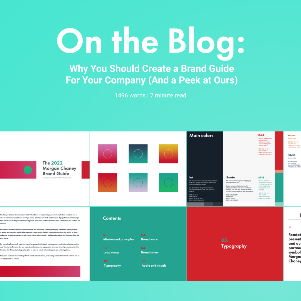
Branding is kind of our bread and butter at Morgan Chaney, and we use a style guide we updated recently to inform our choices on things like graphics, logo usage, and tone of voice in social media, ads, and videos. It helps our designers and writers (hi!) happy because it gives us a good foundation for new projects by laying out expected standards of design.
You can scroll down to the bottom of this article if you’d just like to peek at how we organize our style guide, but I’d encourage you to read on to see some other great examples of what great brands do to keep their style coherent, cohesive, and constant.
What’s in a brand style guide?
Brand style guides are essentially documents that lay out for employees and designers how different elements of a business should be used. We’ve included examples from our own style guide below to give you an idea of what yours might include:
Proper logo usage
Your logo is usually part of a lead’s first touchpoint for your brand, so it’s important to use it properly. Be sure to include it along with proper usages for both web and print (if applicable.) Instructions about minimum and maximum sizes and size in relation to other elements is key to help maintain a brand’s integrity. Additionally, including examples of how the logo shouldn’t be used can help designers understand how to properly display it.
What colors the brand often uses
Brand color alone can increase brand recognition by up to 80 percent, according to a study from the University of Loyola, Maryland. Brand colors are used to create a sense of cohesiveness between different elements of the brand – from social media to physical products.
Tone, voice, and verbiage guidelines
When our team speaks about Morgan Chaney, we use a tone laid out in our style guide. Very simply, we aim to be authentic, helpful, friendly, and witty in all our communications. With that comes a set of expectations for our voice that include more specific metrics like average reading level for written communication, do’s and don’ts for specific situations, and more. Creating a cohesive tone of voice can help customers feel like your team stands uniformly behind your brand.
Typography – how fonts are used for the brand
Typefaces used in your logo, marketing, website, and any other front-facing area should be included in the style guide, along with their weights (how thin or bold they are), common sizes, and web-safe alternatives (very commonly needed for email marketing). Some brands, like ours, also include elements like paragraph spacing and examples of what different kinds of quotes might look like.
If you’re just starting to design your brand, it can help to know which fonts translate well between print and web. While most website builders like WordPress, Wix, and Squarespace will allow you to load in whatever font you want, load times and how it displays on your user’s screen may be worse for non-standard fonts.
Standards for audio and video projects
Less commonly you’ll see brand guides that incorporate how elements of a brand should sound or watch. Companies who routinely publish video ads, podcasts (or podcast advertising), how-tos, or vlogs can extend their style guides to audio and video to help keep those elements cohesive with their brands, too.
In their excellent and very comprehensive style guide, Zendesk, a sales CRM, discusses the philosophy behind their videos alongside how they shoot, edit, animate, and score any film-based elements they may use. They incorporate specific ways of performing each part of their production process – for example, they’re no fans of shaky, sped-up, hyperlapsed, or cross-dissolved footage.
Web styles – how elements on your website and blog look
Some brand guides incorporate examples of how elements on a company’s website are supposed to look. Medium, for example, has directions for how text should be lined up on the web and on their mobile app, and also has designs for buttons and their corresponding meanings. Alienware takes it one step further and also discusses the types of lineart that can be displayed on their website and social media.
In general, including some of the following in your brand guide may make your website adhere better to your overall style:
- Button sizes, shapes, and colors
- Web fonts with font weights and sizes for titles, H1s, H2s, and so on
- Dark mode colors and examples
- Image types approved for banners
- Blog typography and layout
- Responsiveness examples between desktop and mobile (including a guide to screen sizes)
- Call-to-action look and feel
- Email capture look and feel
- Acceptable background and text color combinations
- Social media logo looks
Other media to consider
We’ve seen brand guides include PowerPoint templates, writing samples, words to avoid, rules for photography, rules for speaking about partners and affiliates, and other niche elements in their brand guide. As you’re assembling yours, think about the things that make your brand specific, and make sure to add in anything you do that requires adherence to your style.
Putting it all together
Brand guides are an important technical document for any brand looking to focus their imagery and verbiage and make it easier for their potential customers to discern what your company’s all about. While they can be a technical challenge to put together, they’re extremely helpful in keeping your brand consistent and recognizable, even when multiple people are writing and designing for your company.
View our brand guide
Our brand guide combines some of the things we love most about our examples above, tailored to fit our own personal brand. In general, we aim to be no-nonsense, professional, amicable, competent and lighthearted when we speak about our brand. It’s our hope that our brand guide conveys that, and that it’ll help you in creating your own.
Bonus: Publishing your style guide online can earn you backlinks and business
If you think about it, there’s a very specific subset of people who might be searching for brand guide ideas online: marketers and designers. Big B2B brands know that often the people who are purchasing their services are also the ones looking for inspiration, and so they publish their brand guides online in SEO-friendly formats that help them get some extra-qualified leads.
When you’re done creating your brand guide, show it off by publishing it on your website. Not only does it display transparency in how you run your business (should a lead stumble upon it), but it may also help you win a few qualified leads in the process.
Bonus bonus: some style guides we love
Our team researched a few style guides in creating our own. Here’s some of the best ones we found.
Foursquare
Foursquare gives a detailed rundown for each of their major elements of design in their online style guide. We love the clean layout, clear descriptions of use, and abundance of examples.
The Calgary Chamber of Commerce
City governments are often overlooked as sources of design inspiration (New. York. Transportation.) But some cities really go above and beyond for cohesive, transparent messaging – like the city of Calgary, Alberta.
Cemento
Another unlikely place to find inspiration: concrete. But concrete distributor Cemento has created a gorgeous, brutalist guide that turns their very simple, effective logo into a key pattern used across the brand’s products and web elements. Less isn’t always more – but these folks make a good case for minimalism.