According to a study done by Loyola University Maryland, the human brain prioritizes its perception of color before both image and type recognition. Whether one attributes this to an evolutionary advantage or fluke of nature, the Loyola study is a good indicator as to how significant color actually is when it comes to branding and marketing strategies. In fact, color is so important that this exact same study found that its effective use in a company’s design scheme has the potential to increase brand recognition by up to 80%.
Choosing the Right Color
When it comes to using color in ways which provide customers with an experience that is both identifiable and aesthetically pleasing, professional experts, such as Karen Haller, typically divide individual perception into three separate parts:
First, color symbolism refers to how people may identify a specific color within cultural ideology. For example, green in the United States is often used as a symbol for environmentally friendly products and recyclables, while in Muslim countries such as Saudi Arabia, green represents the prophet Muhammad, giving it a tone of holiness or trustworthiness in branding. (source).

In addition to symbolism, personal color association is a term used to describe individual interpretation of certain colors. Personal color association defines the subjective side of color in marketing, as someone who associates the color blue with the paint on the walls of their room as a child may see it in a different light than someone whose favorite sports team heavily incorporates blue into their uniforms.

Lastly, color psychology contrasts with personal association in the way which it describes how everyone has objective, sub-conscious reactions to certain colors, such as how blue and green may induce calmness or relaxation. These reactions hold true across many different types of people regardless of culture or ethnicity.

In order to fully optimize one’s use of color in branding and marketing, it’s important to evaluate proposed color schemes from a number of different perspectives. For instance, the different colors used for marketing should align with the interests of and appeal to the type of customer a business is looking to target.
Another one of the more obvious considerations is to take into account the values and ideals which one’s brand stands for and identify colors which seem to support these major themes. Furthermore, it is imperative to make sure the chosen colors are conducive to how one wants their company’s image to appear to the outside world.
Branding with Color: Failures and Successes
The use of color to communicate a brand’s goals and narrative has been attempted with successes and failures for many years. Oftentimes a marketing strategy which seems solid in the conference room, may not have the desired effect on brand image which one hoped it might produce or vice-versa.
In one example of a poorly chosen color scheme, Pepsi decided in the 1950’s that they would change the color of their vending machines from royal to light blue, which in many regions of South-Eastern Asia represents a symbol of death. The result for Pepsi was a decline in sales and a massive loss of market share in Asia, all from the slight change of a single color shade.

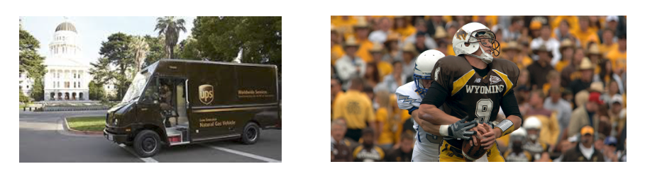
While Pepsi’s blunder stands out as one of the more prominent examples of marketing failure in the corporate world, miscalculations in the selection of color extend into the realm of athletics and sports as well. Recently, Wyoming University was ranked as having some of the worst football uniforms in all of sports, as their brown jerseys with yellow accent fail to reflect a sense of high energy and intensity that any successful football team must bring to the field.
Many people would agree that dark brown and yellow are not the best colors for communicating to fans and observers the general characteristics of excitement, ferocity, and strength that comprise of a talented football team. However, put to use in a different context, this color scheme can be used to create a much more successful and timeless brand image. UPS is a great example of a company who uses the exact same colors as Wyoming football but with a completely contrasting effect. UPS provides shipping and distribution services to consumers who aren’t exactly worried about their packages being delivered by a high-energy truck driver, rather the brown and yellow in their logo clearly represents reliability and consistency. By changing the circumstances in which certain colors are used, their effects on brand appearance can be shifted as well. (source).
Color Branding in Packaging
From subconscious color psychology to cultural meaning and context, what does all this mean for packaging? Sometimes, it’s enough to simply place one’s product in a cardboard box and ship it off, but as we’ve seen throughout various examples in the marketing industry, this may not be the right choice in particular scenarios.
For any specific good that is purchased in store or online, the package it comes in is typically the first thing a customer sees. Regardless of what’s inside, the appearance of a package can create a sense of luxury, eco-friendliness, or even happiness that precedes the actual product, and much of this sense is largely based on the color scheme a company chooses to display.
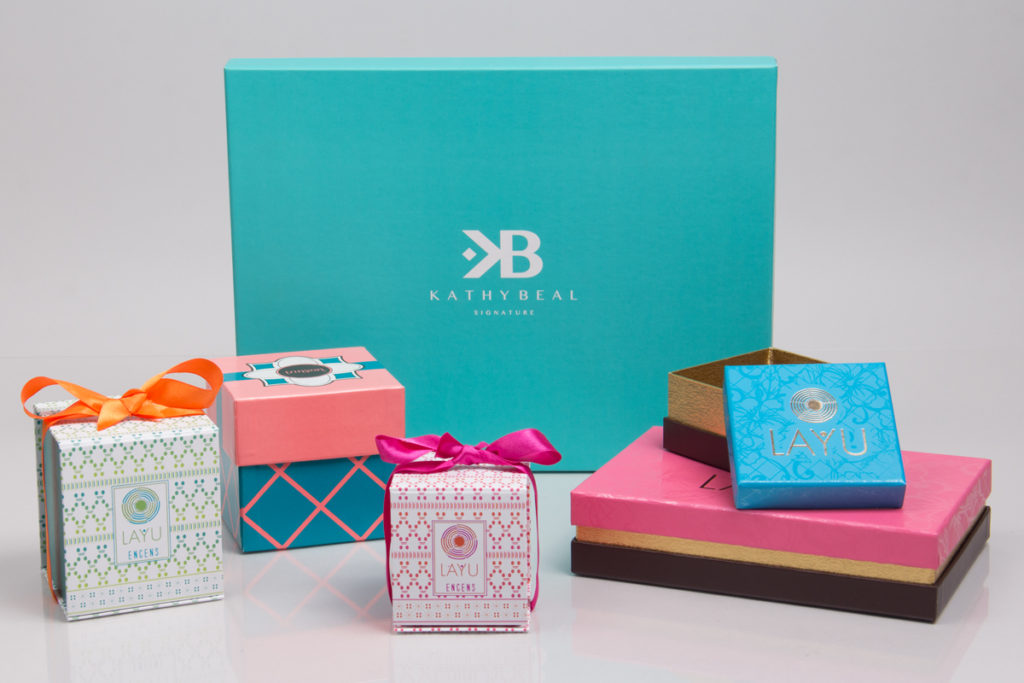
Without even experiencing the product, the color of the packaging it comes in has the ability to induce feelings, emotions, and attitudes in the people to which a business wants to market. Whether its boxes, bags, or tissue paper, what the customer sees before they open up a package is extremely important in conditioning how they may feel about the product inside.
While there are many different ways to make your own packaging look unique and stylish, selecting the right blend of colors that either stands out or carries some type of significance with the customer is definitely one of the most crucial aspects of branding any product.
Sources used:
https://www.colormatters.com/color-and-marketing/color-and-branding https://www.creativebloq.com/features/the-designers-guide-to-using-colour-in-branding