Let’s get scientific for a second: did you know that the human brain can perceive signals of light and color sent by the eyes in as little as 13 milliseconds?
That impact – and the impact of color in general for humans through a cultural lens – is important in deciding which colors might work as a visual representation for your brand.
What do colors say about your company, and how do you use them to represent your brand identity in your packaging in a way that appeals to potential customers?
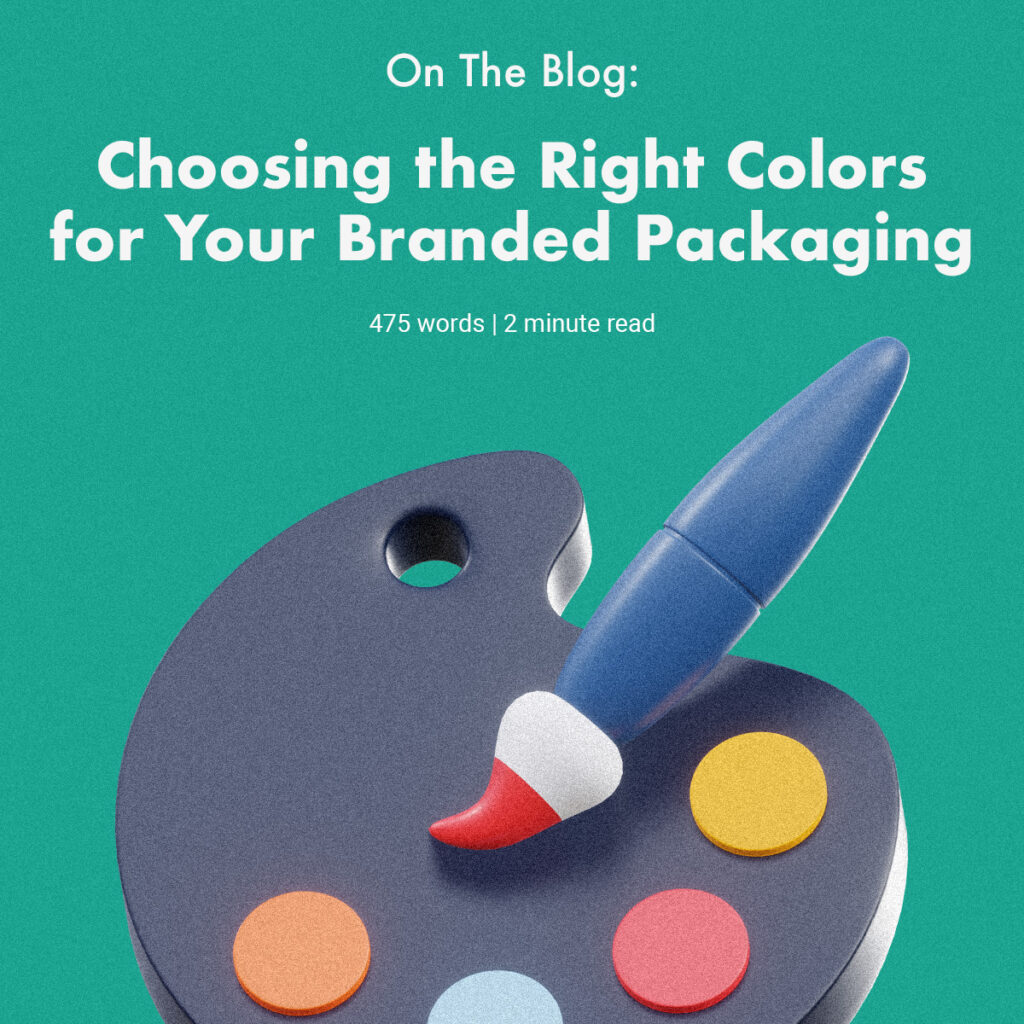
How to choose the right colors for your packaging
There’s no one right way to pick a brand color – but here are some threads to help inspire you:
- Think of your customer: What is your customer looking for in a brand? What sorts of qualities are important to them in a product? What colors are associated with each of those things?
- It’s (sometimes) all in the product: Are there key ingredients in your product from which you could pull a hallmark color?
- Consider culture: what does the color you’re thinking of say to your audience?
- Color the main emotion of your brand: is your brand fun and casual? Use brighter, trendy colors, as opposed to more formal muted tones.
The psychology of packaging colors
Despite the buzz around it, color psychology actually doesn’t have a lot of large, peer-reviewed studies surrounding it. However, a few studies like this one from Hubspot show that color can play a crucial role in marketing and branding. For what it’s worth, color can also signify a closeness or distance from competitors and well-known brands.
Here’s a quick rundown of colors and their associations:
- White: simplicity, elegance
- Brands like Apple and Dove Soap use white to convey the simplicity and transparency of their products.
- Black: Sophistication, luxury, power
- Black packaging can create a really luxurious backdrop for products.
- Blue: Strength and honesty
- Brands like Facebook, Gerber, and JetBlue use blue to great effect.
- Red: Excitement, passion
- Coke and McDonald’s use vibrant red to convey excitement and youth.
- Green: Growth, nature
- Many brands use green’s obvious connection to nature to highlight natural ingredients in their products.
- Orange: Playfulness, adventure
- Fanta, Gulf, and Nickelodeon all use orange to display playfulness, youth, and adventure.
- Yellow: Optimism and energy
- Sunny yellow is used by brands like Lego to appeal to their youthful audience.
Final tips for choosing packaging colors
Your customers matter most when you’re choosing a color to represent your brand’s packaging. Make sure that you keep them and their associations with potential color choices in mind as you make your color selections.
Happy packaging creation! 📦